Standard "15% off" popups have been stuck at the same low conversion rates for years.
While most brands settle for those tiny wins, a few smart Shopify stores are swapping static boxes for spin wheels, mystery gifts, and quick games. These shops are seeing opt-in rates jump past 20% or even 30%.
It works because you're turning a boring "give us your email" ask into a fun interaction. People love winning, and they're way more likely to use a discount they actually earned
Check out these 12 gamified poup examples to see the psychology and real results behind the best interactive setups.
Read on to see which games drive the most sales.
TL;DR — The 12 Gamified Popup Types at a Glance
Why Gamified Popups Convert Better Than Static Ones
Three psychological levers do most of the heavy lifting:
Variable rewards. The brain's dopamine response spikes harder for uncertain rewards than predictable ones — the same reason slot machines work. A shopper who spins a wheel or scratches a card doesn't know if they'll get 10%, 15%, or a free product, and that uncertainty is the draw.
Sunk cost of attention. Once a shopper has clicked "spin" or answered a question, they've invested a few seconds. That small investment makes them far more likely to complete the email step — they don't want to walk away from what they just started.
Perceived value. A code a shopper "won" feels more valuable than a code they were handed. This is backed by decades of behavioral research and shows up in redemption data: gamified codes get redeemed at noticeably higher rates than standard welcome-offer codes.
For a deeper breakdown of the behavioral science, see gamification strategies to increase customer loyalty.
12 Gamified Popup Examples
1. The Classic Spin-the-Wheel

The mechanic: The shopper sees a wheel divided into slices — 5% off, 10% off, free shipping, mystery gift, "no luck." They enter their email, click spin, and win a prize.
Why it works: The wheel is the most recognizable gamification mechanic on the web. Shoppers know what to do instantly. The wheel's visual motion grabs attention even from distracted browsers.
Best for: High-traffic Shopify stores with room in their margin for discounting, especially apparel, beauty, and accessories.
How to implement spin-the-wheel popups:
- Slice structure: Use 4–6 slices with 2–3 real reward tiers (e.g., 10%, 15%, free shipping, free gift). Skip "no luck" slices — every spin should win something.
- Win odds: Weight the top-tier prize (e.g., 25% off) at 5–10% probability and the entry reward at 60–70% to protect margin.
- Animation: Keep the spin under 3 seconds. Anything longer feels rigged or laggy on mobile.
- Brand fit: Theme wheel colors, fonts, and copy to match your site — generic templates consistently underperform branded ones.
Watch out for: The "no luck" slice also creates a tiny number of frustrated visitors, though most brands skip that slice entirely and give everyone something.
Spin wheels are a well-studied format — for seven worth stealing and when they make sense, see 7 spin the wheel popup examples worth stealing.
2. Quiz-Based Product Finder

The mechanic: The shopper answers 2–4 questions about their preferences — "What are you shopping for?" "Where will you use it?" — and the popup recommends a product (or product category) plus a matched discount code.
Why it works: The shopper gets something genuinely useful — a curated recommendation — before they're asked for an email. The quiz also produces zero-party data the brand can use to segment and personalize every future email.
Best for: Multi-SKU catalogs, outdoor, wellness, beauty, and any brand where a "which product is right for me?" question is natural.
How to implement quiz-based popups:
- Question count: Cap at 2–4 questions. Beyond four, abandonment climbs sharply.
- Question type: Use multiple-choice with visual icons or product images, not free text.
- Recommendation logic: Map answers to a single recommended product or category — don't surface every match.
- Sync to ESP: Pass quiz answers as profile properties (not just tags) so they flow into long-term segmentation in Klaviyo, Omnisend, or Sendlane.
For tips on building quiz flows that feel helpful rather than salesy, see creating effective quizzes for product recommendations.
Essence Vault tripled email opt-ins to 33% and collected 360K emails in one month
EMAIL OPT-IN RATE (UP FROM 11%)
SMS OPT-IN RATE (UP FROM 4.2%)
EMAILS COLLECTED IN ONE MONTH
"Postscript's system was fairly limited in design, which held us back from truly maximizing our sign-up rates… We never expected the numbers to go this high. In just a few months, we added over half a million emails to our database."
Install Alia
Launch first popup in 5 minutes
10x your list

Read the full case study here →
3. Educational Trivia Popup
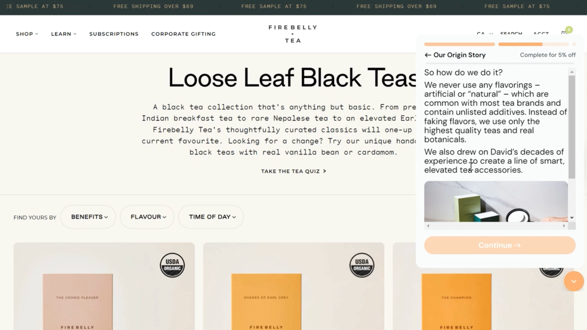
The mechanic: Instead of asking the shopper for an email upfront, the popup teaches them something — one or two slides about the brand's story, differentiators, or product benefits — and then delivers the ask after the shopper has engaged with the content.
Why it works: Educational popups convert the popup surface from "pay us with your email" to "learn something interesting." Premium and mission-driven brands see disproportionate gains here because their shoppers often bounce before they understand why the product costs what it does.
Best for: Premium CPG, wellness, functional products, mission-driven brands, and anything that needs a story to justify the price point.
How to implement educational popups:
- Slide count: 1–2 educational slides before the email ask. More than two and engagement drops.
- Story angle: Lead with founder story, ingredient/sourcing differentiator, or a single surprising stat — not a feature list.
- Ask placement: Deliver the email capture after the educational content. The lesson earns the ask.
- Welcome flow tie-in: Reinforce the same lesson in your first welcome email so the brand story compounds across touchpoints.
Real-world result: Firebelly Tea (founded by Shopify's President) used educational popups to deliver brand lessons before the email ask, 2x'ing their signups and generating $13K in incremental revenue.
Read the full case study here →
Hostage Tape took a similar angle, integrating the founder's story into its full-screen popup and pushing welcome flow revenue up 245%.
Read the full case study here →
For a full breakdown of educational popups as a format, see the ultimate guide to customer education on your e-commerce site.
4. Mystery Discount Reveal

The mechanic: The popup shows a hidden offer — "Enter your email to reveal your exclusive discount" — without specifying the percentage. After the email is entered, the code reveals: 10%, 15%, or whatever the brand's tested sweet spot is.
Why it works: Curiosity. Shoppers want to know what they're getting. A plain "10% off" is easy to skip; "your exclusive offer is waiting" isn't. It also protects the brand from anchoring shoppers to a specific discount number before they even see the product. Not sure whether to show the offer upfront or gate it? Here's the data: should you show discount codes on sign-up forms?
Best for: Premium brands hesitant to blast discounts on the homepage, and any brand where the offer value shouldn't be the first thing shoppers see.
How to implement mystery reveal popups:
- Copy: "Reveal your exclusive offer" consistently outperforms "Get a discount" in tests.
- Range hint: Tease a range ("up to 20% off + a free gift") if the variance is wide enough to matter.
- Reveal mechanic: Use a 1–2 second animation when the code unveils — instant reveals feel anticlimactic.
- Code delivery: Show the code on screen and email it. Shoppers who close the popup want a backup.
Real-world result: Fishwife, the woman-led premium tinned seafood brand, introduced mystery-discount popups and saw total opt-ins grow 5x, SMS list size grow 6x, coupon redemptions climb over 200%, and welcome flow revenue lift ~200% in six months.
Read the full case study here →
5. Pick-a-Gift / Treasure Chest

Image source: Popup Builder
The mechanic: Three or four wrapped boxes, chests, or gift bags appear on screen. The shopper picks one, it "opens," and the prize reveals. Email is captured either before or after the reveal.
Why it works: The act of choosing gives the shopper a sense of agency — they picked this one. That tiny decision creates investment. It's also visually softer than a spinning wheel, which makes it a better fit for brands that want gamification without the carnival aesthetic.
Best for: Subscription boxes, beauty, gifting brands, holiday campaigns, and anywhere the "gift" metaphor fits the category.
How to implement pick-a-gift popups:
- Box count: 3 boxes converts better than 4 — fewer choices, faster decision.
- Reward variation: Vary the rewards behind each box (e.g., 15% off, free shipping, free product). Identical rewards in disguise erode trust quickly.
- Visual style: Use brand-matched illustrations (gift bags for holiday, treasure chests for kids' brands) over generic stock graphics.
- Email timing: Capture the email before the reveal — don't gate the reward behind a second step.
Watch out for: Making all the prizes identical in disguise. Some shoppers figure out the trick quickly, which can erode trust. Varying the rewards (even slightly) keeps the mechanic honest.
6. Scratch Card

The mechanic: A visual scratch-off card appears. The shopper drags their cursor (or finger, on mobile) across the card to reveal the discount underneath.
Why it works: Scratch cards mimic a lottery ticket — a cultural touchpoint that signals "there's something hidden here." The physical-feeling interaction (especially on mobile, where the finger-drag is satisfying) boosts engagement.
Best for: Playful, casual brands — snacks, apparel, accessories, home goods.
How to implement scratch card popups:
- Mobile testing: Test on mid-tier Android devices, not just iPhones. Lag here kills the format.
- Scratch threshold: Trigger the reveal at 40–50% of the card scratched, not 100%. Shoppers shouldn't have to clear the whole surface.
- Reward variance: Use 2–3 real prize tiers behind the scratch so the reveal feels genuine.
- Fallback: Offer a "tap to reveal" alternative for devices that can't render the scratch interaction smoothly.
Watch out for: Load performance. Scratch-card animations can feel sluggish on mid-tier Android devices. Test on real mobile hardware before shipping. For a broader look at mobile popup considerations, see mobile popup best practices.
7. Interactive Poll With Reward (The Graza & Portland Leather Example)

The mechanic: The popup asks a single light question — "Which product are you most interested in?" "What brought you here today?" — offers 2–4 answer options, and then delivers the ask on the next step.
Why it works: Polls feel low-commitment. There's no wrong answer, no quiz score, no gamble. The shopper taps a button and feels heard. Behind the scenes, the brand now has a valuable piece of zero-party data that flows into every email segmentation decision going forward.
Best for: Brands where segmentation drives email revenue — food, beauty, fashion, home, CPG.
How to implement interactive poll popups:
- Question framing: Keep it light and curiosity-driven ("Which of these are you shopping for?") rather than demographic ("What's your age?").
- Answer count: 2–4 options with icons or product images. Text-only polls underperform.
- Tagging: Tag respondents in your ESP based on their answer — that's where the real long-term value lives.
- Reward timing: Show the discount immediately after the answer, then capture the email on the next step.
Real-world result: Graza, the single-origin olive oil brand, replaced Klaviyo's native form with an interactive, quiz-based popup and saw their email signup rate jump from 4.5% to 13.8%, plus a 377% growth in net new SMS opt-ins.
Read the full case study here →
For a deeper look at how to use this data post-capture, see personalization techniques to enhance the shopper experience.
8. Slot Machine

Image source: GetWPFunnels
The mechanic: Three spinning reels, each showing icons or discount amounts. The shopper taps "pull" and the reels land on a combination that determines their prize.
Why it works: It's instantly recognizable and the reel animation creates tension. Pairing three matching icons feels like a "win" even if the reward is the same as any other outcome.
Best for: Lifestyle, entertainment, and CPG brands comfortable with a slightly louder aesthetic.
How to implement slot machine popups:
- Reel content: Use brand icons or product images on the reels, not generic cherries and bells.
- Spin speed: Keep the animation under 4 seconds. Stretching it for "tension" backfires.
- Language: Avoid "jackpot," "place your bet," or other gambling terms — especially in regions with strict ad rules. "Spin to reveal your reward" is safer.
- Outcome variance: Build in 3+ reward tiers so a "match" feels meaningful instead of arbitrary.
9. Memory Match Game

Image source: Stripo
The mechanic: A small grid of face-down cards. The shopper flips two at a time, matching pairs to unlock the reward.
Why it works: It's a proper mini-game — longer engagement, more sunk-cost investment, stronger conversion on completion. The tradeoff: higher abandonment mid-game.
Best for: Kids' brands, family-oriented products, and brands targeting a lower-rush audience that's willing to play.
How to implement memory match popups:
- Grid size: Start with a 4-card (2 pair) or 6-card (3 pair) grid. Larger grids push too many shoppers into mid-game abandonment.
- Email capture timing: Capture after the first successful match, not on full completion. Don't lose shoppers who quit at 60% done.
- Reward reveal: Unveil the discount on the final match — give shoppers a reason to play through to the end.
- Replay logic: Allow one replay if they fail, then deliver a baseline reward so no one walks away empty-handed.
Watch out for: Completion-gating the email. Some brands require the full match before capturing the email, which loses shoppers who abandon at 60% complete. Better: capture email after the first successful match, reward on full completion.
10. Countdown Challenge

The mechanic: The popup combines a countdown timer with a task you need to complete before it ends.
Why it works: Urgency layered on top of gamification creates a double-lever: the game holds attention, the timer forces decision. It's one of the highest-converting formats for shoppers already close to purchase. For a wider look at urgency tactics, see 8 limited time offer examples that drive sales.
Best for: BFCM, product launches, flash sales, and any moment where genuine scarcity exists.
How to implement countdown challenge popups:
- Timer length: 15–30 minutes for in-session urgency. Shorter feels manipulative; longer loses tension.
- Real scarcity only: Reserve this format for actual flash sales, BFCM, or product launches. Permanent countdown timers train shoppers to ignore them.
- Visual cue: High-contrast colors (red, orange) on the timer digits. Black-on-white timers don't register.
- Persistence: Once the timer starts, don't reset it on page refresh — that breaks the urgency instantly.
Watch out for: Fake urgency. Shoppers who see the same "last chance" timer on every visit stop believing it — and the brand's credibility takes the hit. Use countdown challenges for real, time-bounded moments.
11. Seasonal Themed Game

The mechanic: A holiday- or event-specific version of any of the above mechanics — a Halloween pumpkin-smash, a Christmas gift-unwrap, a Valentine's heart-match, a BFCM doorbuster grid.
Why it works: Timely relevance. A shopper who lands on your site during a moment you've themed around feels like the experience was built for them, not recycled from Q3.
Best for: Anyone with a meaningful seasonal calendar — which is to say, most Shopify brands. For BFCM-specific plays, see 9 Black Friday popup ideas and templates.
How to implement seasonal themed popups:
- Calendar planning: Map gamified variants to your seasonal calendar 4–6 weeks ahead — Halloween, BFCM, Valentine's, summer, back-to-school.
- Theme depth: Theme the visuals, copy, and reward language — not just the background. A pumpkin-smash with generic "10% off" copy reads lazy.
- Brand fit: Skip seasons that don't match the brand. A premium brand running a Halloween popup can feel forced.
- Lead time: Launch 1–2 weeks before the seasonal peak so the popup has time to optimize before the traffic surge.
12. Tiered Reward Unlock

The mechanic: The shopper gets different rewards based on how much they spend — free gift at $50, free shipping at $75, 15% off at $100. The popup visualizes the tiers and their progress toward each.
Why it works: It's a gamification format aimed at AOV, not just opt-in. Shoppers see how close they are to the next tier and add items to hit it. The best versions pair this with real-time cart tracking so the bar fills as the shopper shops.
Best for: Stores where AOV is the bottleneck and unit economics support tiered rewards. For a deeper dive on why AOV matters, see why AOV is so important for e-commerce growth.
How to implement tiered reward popups:
- Tier spacing: Set thresholds 30–50% above your current AOV, not 2x. Unreachable tiers demotivate instead of motivating.
- Tier count: 3 tiers is the sweet spot — free gift, free shipping, then a percentage off or a premium gift.
- Real-time tracking: Pair the popup with a sticky cart bar that fills as the shopper adds items. The visual progress is what drives the upsell.
- Reward clarity: Show what's earned at each tier, not just the requirement. Shoppers want to see the prize, not the math.
Anatomy of a High-Converting Gamified Popup
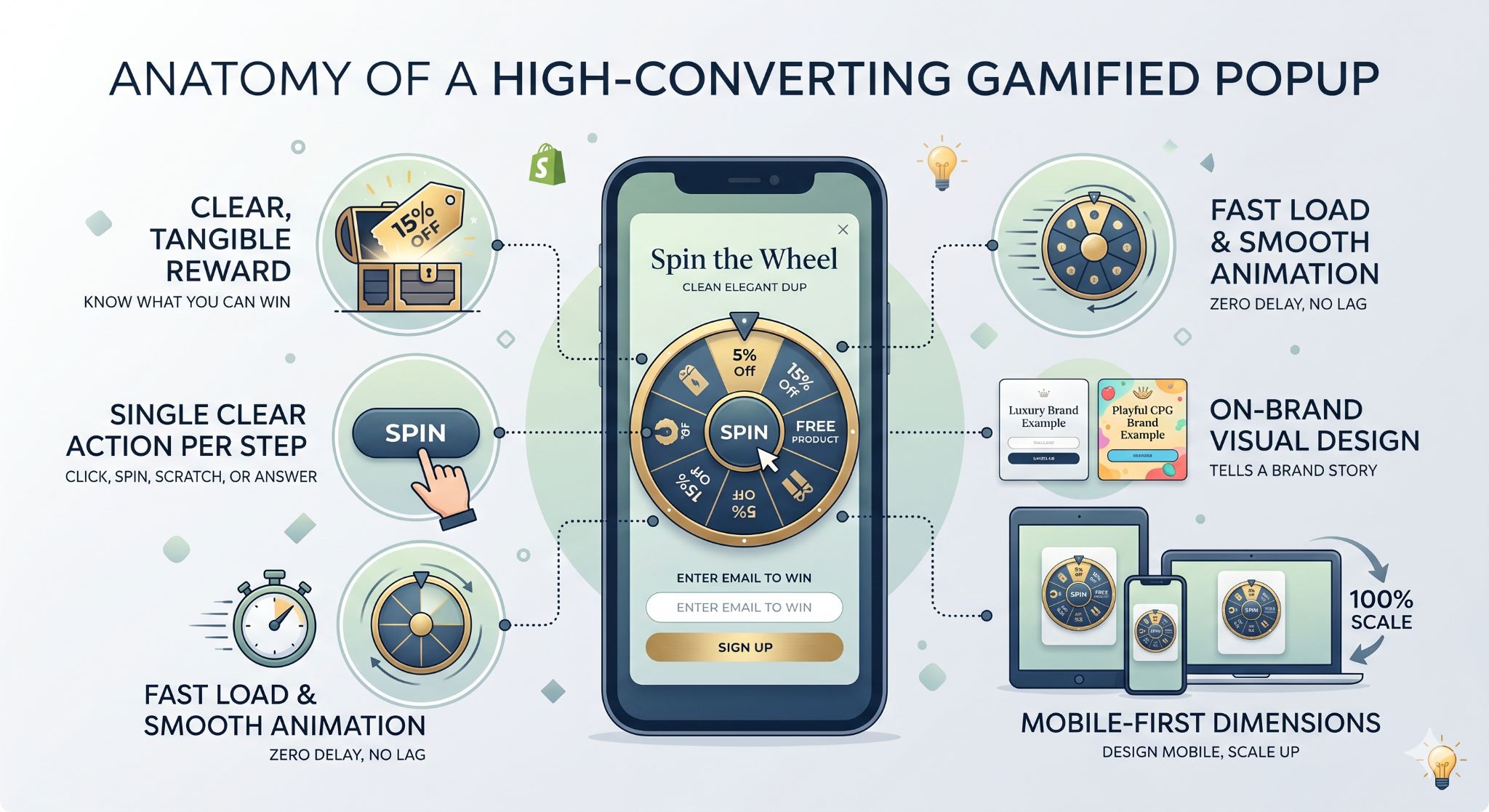
The popups that hit 20–30%+ opt-in rates all share the same structural DNA. Break any of these and performance drops:
A clear, tangible reward. "Spin to win" with no stated prize category converts worse than "Spin to win up to 25% off or a free product." Shoppers need to know the reward type is worth their time before they'll engage.
A single clear action per step. The first step should ask for one thing — click, spin, scratch, answer. Don't combine the game and the email capture in the same visual moment. The game earns the email; they shouldn't happen simultaneously.
Fast load and smooth animation. A gamified popup that lags on mobile is worse than no popup at all. Every 100ms of delay costs opt-ins.
On-brand visual design. The mechanic should feel like it belongs to the brand — a luxury brand using a cartoonish spin wheel reads wrong. Templates that can be themed to brand colors, typography, and voice outperform generic templates every time.
Mobile-first dimensions. The majority of Shopify traffic is now mobile. A popup designed desktop-first and scaled down will underperform. Design mobile, scale up.
Best Practices for Gamified Popups
To move past basic opt-in rates, you need a strategy that respects the shopper’s journey. Here is how to optimize your interactive elements:
- Trigger Smart, Not Fast: Don't fire a popup the second someone lands. Use exit intent, scroll depth, or second-page visits. Alia's Smart Triggering uses real-time behavior to find the perfect moment, often boosting signups by 10–30%.
- Test the Mechanic, Not Just the Copy: Swapping a headline is fine, but testing a wheel vs. a quiz is where the big wins live. Alia's Smart Testing runs those tests automatically, 24/7.
- Respect Your Subscribers: Nothing ruins a user experience like asking an existing customer to sign up again. Use a tool that checks cookies and UTM patterns to hide popups from people already on your list.
- Prioritize Zero-Party Data: A quiz or poll that captures preferences (like "skin type" or "favorite color") is worth 10x more than a raw email. This data makes your future email marketing much more effective.
- Honor the Reward: Ensure your discount codes work instantly. If a shopper "wins" 20% off, that code should be easy to find and valid. Broken promises are the fastest way to lose a customer's trust.
- Cap Your Frequency: Limit popups to once per session or once every seven days. Showing the same game repeatedly feels desperate and intrusive.
For more on trigger logic, see popup timing and triggers.
Common Mistakes That Kill Gamified Popup Performance
Avoid these frequent pitfalls to keep your engagement high and your brand reputation intact:
How to Build a Gamified Popup on Shopify
The process, broken down:
1. Pick the mechanic that fits the brand and goal. Spin wheels work for discount-driven fashion; quizzes work for multi-SKU catalogs; mystery reveals work for premium brands protective of margins. Don't pick based on novelty.
2. Design the reward structure. Decide the 2–4 real rewards, their probabilities, and their unit economics. A 25% off "jackpot" that rarely fires costs less than a flat 15% across the board — but only if the math checks.
3. Choose a popup app that supports the mechanic. Shopify's native popup doesn't support most gamified mechanics. Dedicated tools like Alia were built for this — purpose-built popup software for Shopify with quiz, educational, and interactive templates, plus automated testing and smart triggering. Compare the top options in best Shopify popup apps.
4. Design the popup around mobile. Build the mobile version first, test on real devices, then scale to desktop. Most Shopify traffic is now mobile.
5. Integrate with your ESP. Make sure the captured emails flow directly into Klaviyo, Omnisend, Sendlane, or whichever ESP you use, and that the zero-party data from quizzes is passed as properties for segmentation. For Klaviyo specifically, see how to integrate Alia with Klaviyo.
6. Build a welcome flow that honors the reward. The first email after the opt-in should deliver the code, reinforce the reason for the discount (the game), and start the shopper's brand story. See how to launch an e-commerce loyalty program users love for adjacent thinking.
7. Launch, measure, iterate. Don't rely on opt-in rate alone. Measure welcome-flow revenue, coupon redemption rate, purchase rate on first order, and AOV. A popup with a 30% opt-in rate but 2% redemption is underperforming a popup with 15% opt-in and 15% redemption.
For a step-by-step technical walkthrough, see how to add pop-ups on Shopify in under 10 minutes.
Also comparing other tools? Read these next:
Why Alia Powers Most of the Gamified Popups in This Guide
The record-breaking results featured in this guide—from Nakie’s 35% signup rate to Fishwife’s 5x opt-in growth—share one common denominator: they were all built using Alia.
As the only AI-powered platform built exclusively for Shopify, Alia moves beyond generic "spin-to-win" templates to deliver high-performance, gamified interactions.
Core Features Built for Gamification
- Smart Triggering: Alia analyzes real-time behavior to fire your game at the exact moment of highest conversion probability. This feature alone typically adds 10–30% more signups instantly.
- Hands-Free Smart Testing: Stop manual A/B testing. Alia runs tests 24/7, automatically testing different game mechanics (like a quiz vs. a wheel) to find what your audience actually prefers.
- Zero-Code Interactive Editor: Build complex quiz-based flows, mystery reveals, and educational multi-step popups without needing a developer. Browse ready-to-use templates to get started fast.
- Advanced Targeting: Deliver unique games based on traffic source, geography, and funnel stage—ensuring the right shopper sees the right challenge.
- Native Shopify Integration: Enjoy a one-click install with zero performance drag, ensuring your animations and games load smoothly on mobile.
Ready to gamify your growth? Pricing starts at $200/month with a 14-day free trial. Brands on the Fully Managed plan get an extended 30-day trial to see the interactive impact firsthand.
Go Beyond the Standard Popup
In 2026, winning at email and SMS growth isn't about being the loudest; it's about being the smartest. While spin wheels are great, quizzes and educational popups are often better for building long-term value. The right interaction protects your brand's premium feel while gathering data that makes every future email more personal.
Success comes down to three things: a mechanic that fits your brand, a trigger that hits at the right moment, and a reward that feels earned. When you move away from generic templates and toward real interaction, your conversion rates follow.
Beat the 3% benchmark with Alia
If you're tired of static boxes that shoppers ignore, it's time to try a platform built for these exact results. Alia is designed specifically for Shopify brands that want to turn casual browsers into loyal customers through quizzes, mystery reveals, and interactive games.
Explore Alia’s gamified templates or book a demo to see how we can help you hit those 20%+ opt-in rates.
Frequently Asked Questions
Are gamified popups annoying to shoppers?
Only when they're implemented poorly — firing instantly, repeating every visit, gating useful content, or delivering broken codes. A gamified popup timed to the right moment with a real reward is perceived as fun, not intrusive. For a broader take, see how to create engaging popups without annoying your customers.
What's the best gamified popup for a brand new Shopify store?
Start with a quiz-based or educational popup rather than a spin wheel. New stores don't have the traffic volume for a wheel to optimize itself, and the zero-party data from quizzes is disproportionately valuable early on when segmentation fuel is limited.
Should the popup appear on mobile and desktop?
Yes, but with different mechanics and dimensions. Mobile shoppers convert better on simpler interactions (swipe-to-reveal, tap-to-open, single-question quiz) than on multi-step wheels or memory games. Design the mobile version first. See mobile popup best practices.
How often should the popup show?
Once per session, with a 7+ day cooldown for returning visitors. Existing email subscribers should never see it — a good popup tool suppresses them via cookie and ESP script detection.
How do I measure if my gamified popup is working?
Don't just track opt-in rate. Track welcome-flow revenue, coupon redemption rate, first-purchase rate, AOV on first purchase, and 90-day LTV of opted-in shoppers. A popup with a 30% opt-in rate and 1% redemption is worse than a popup with 12% opt-in rate and 12% redemption.
Do gamified popups hurt site speed?
They can, if poorly implemented. Well-built popup apps load asynchronously and add minimal weight. Alia's native Shopify embed is designed not to drag down Core Web Vitals, which matters for SEO and paid traffic landing page scores.